

I’m on noob on Blorp, but the icons to comment on someones comment on a post versus when sending a private message to someone need to be switched.
Sounds like a Blorp design decision, not lemmy in general.
that sounds like a blorp problem, not a lemmy one.
theres many apps that can be used to access lemmy… or my fav app for these kinds of websites, firefox
I picked blorp due to how the posts are layered out. Its like a slower version of twitter. I use firefox too on PC, but yeah this is something I definitely gotta get used to.
You can degoogle your phone but think this is a reasonable question to ask? On a three day old account? You don’t know the difference between a client app and Lemmy? This UI design doesn’t stand out since the heydays of third-party reddit apps. Occasionally, this community’s title appears to be proven wrong.
First off, I didn’t degoogle the new phone I got. I brought it from Muera cause I didn’t want to go through the debacle of the “finding the exact model number” requirement when it comes to installing some of these OS systems.
Also, this is my first time on Lemmy. Never been here before and just checking it out. I am just exploring their different UI until I found one that’s the most comfortable to me. Not a pro at this at all.
And most don’t have that knowledge of looking at those technicalities, I know I dont. You people on some of these techy platforms really need to stop assuming that everyone knows everything about hardware/software of tech.
If your really butthurt over a rookie ass question, that’s a you problem. Along with it being just a comment on how I just didn’t like how the interface looked. Grow up.
??? Can you post a screenshot in order to explain to the rest of us who don’t know what “Blorp” is?
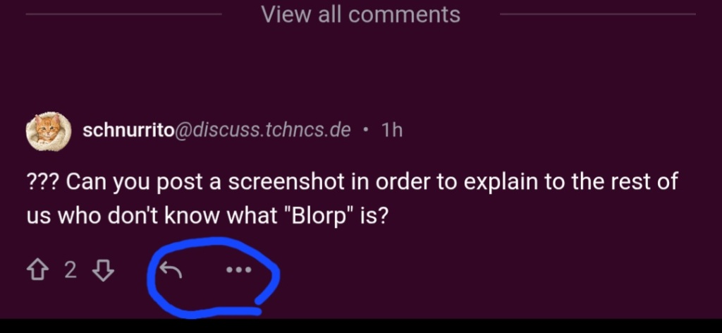
what’s in the circle is what i’m talking about. The arrow is to directly comment you while the 3 dots is to either send you a private message, share a post/link or to report someone or something. I wouldn’t think the arrow would mean to comment until I click it. That looks more like a “reshare” button.OK, that looks similar to the interface I am using…
But why would you not expect replying to a comment to be the most visible, most easily accessible, “default” action? It’s certainly what people do the most.
Its just Blorp being Blorp😅
yeah but you say switched. I mean personally reshare does not really mean anything to me. It looks like reply for an email so I take it as reply. I certainly would not want it to be three dots or an option under the three dots and for pull down menus I would want them on the far right.
My bad, I meant changing the look of the icons for what they are, when I say switch. Idk… maybe its because I’m so used to big tech media.
now that option for the 3 dots is a better idea so the pop up does appear better. Currently, It appears on the screen as if some options are cut off when you click on it.
if you really hate it piefeds reply is the word reply along with a cartoon type speech buble and its on the far left. the thre dot menu is on the far right with a lot of void space between it and the left stuff but it shares its space with the notify icon.
I’ll see how I feel as time goes on. Still gettung used to it all.
That is more an issue of your client than Lemmy itself.
Fortunately, the Blorp dev @[email protected] is an active user and seems to value app feedback


