

Damn this comment section is a wild exercise in why liberal thoughts don’t matter
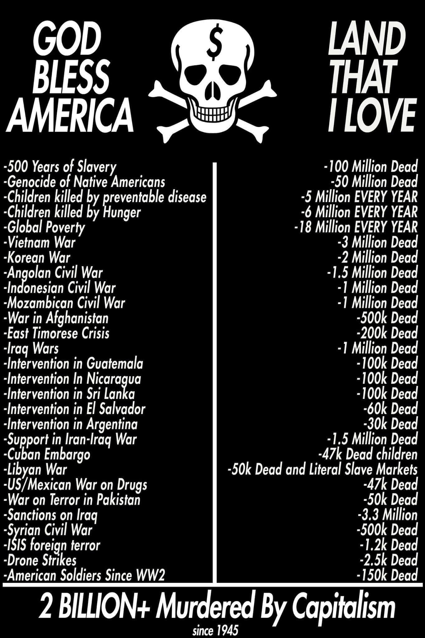
The math is wrong by a magnitude of 10. Total is about 200 mil in the picture.
Edit: My bad, I failed to take into account that some items are per year. Now the total makes sense.
The numbers on this chart are nonsense.
A very quick internet search shows that approximately 10 million indigenous people existed in the United States prior to European involvement (https://worldpopulationreview.com/state-rankings/native-american-population). How did 50 million die?
The estimated number of African Americans who died from the slave trade is estimated between 1 and 2 million (https://www.clrn.org/how-many-slaves-died-in-american-history/).
The Indonesian civil war casualties are estimated just over 100,000. (https://en.m.wikipedia.org/wiki/Indonesian_National_Revolution). And the United States wasn’t even involved in that one.
And those are just the three I checked. My guess is every single number on this chart is wrong. I agree that capitalism sucks and has killed lots of people, but pushing nonsense doesn’t help anything. You could put the real numbers on there and still get the point across.
How did 50 million die?
1 in 4 live in poverty, the highest percentage of any other community. Poverty caused by capitalism
You’re operating under the assumption that these clowns understand that the genocide was a generational effort.
That is not a good assumption.
These people don’t even know what “per year” means.
So are we talking about worldwide or the United States? The chart says the United States so I am assuming we are focusing on the US here.
My links only address the US