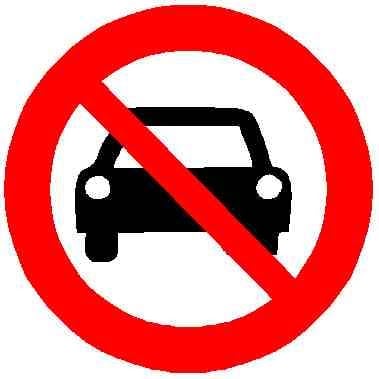
All language and meaning is rooted in culture - including pictograms.
What would lead to the highest rate of adoption would be universality - both in use and in meaning, which, unfortunately isn’t there yet.
Some european countries use the “crossed out” version on all prohibition signs (circular, black on white with a red outline, and the rest only on directional arrows. No state doesn’t use them, thus failing the secind aspect of universality (consistency).
In general, a red circle means “no”, regardless of it being crossed out. Swapping the red outline for black (and adding in the cross for good measure) suddenly makes the sign mean “now yes”.
Blue signs (obligation) sometimes carry stronger instructions than red ones, and often times the same (e.g. “no tirning left” or “you can only go right” mean the same).
Some places, for readability’s sake make the cross made of multiple thinner lines with empty space, showing the pictogram underneath.
However, what you showed is in fact poor design, as opposed to what you’re calling poor design yourself.
Most people aren’t colorblind in that they don’t see any color (just shades of grey), most, in fact, do see some colors.
Wanting to be fully inclusive, we have three main categories of signs to cover (currently used under the Vienna convention). These are: Obligatory signs (red on blue, no outline), Prohibitory signs (black on white, red outline) and End of prohibition (black on white, black outline, crossed out).
These signs can be fully distinguished by someone truly colorblind - the first group of signs has no outline, the second does, and the third is additionally crossed out.
Sure, the second and 3rd categories could’ve been swapped out (red being additionally crossed out and black not).
However, the Vienna convention was written in the late sixties, pretty much at the apex of black-and-white photography. So, on a b&w photo, a red sign wouldn’t be red. It being crossed out (and black), someone not colorblind would probably jump to the conclusion that, crossed out, it wasn’t important. The outline gives some additional contrast on a light background, carrying a resound meaning - “yes” or “no”.
That’s why this style was chosen. It’s a vestage of a bygone era, but in context it makes sense. And, with “true” color blindness being kind of like a black-and-white camera, the current arrangement is in fact probably the best for colorblind people.
Additionally, when rolling down a highway past the sign you glanced at only for a split second, the red cross would only serve to obscure the pictogram. The pictogram being whole aids in legibility. If it’s the end of the prohibition, it not being as clear seems to be the better alternative.


You could also open a 2nd restaurant if the first does too well - just say you use it to make your great food accessible to more people and to test new products before risking your reputation. The part about “I want me some cash to mix in some of my dirty money” can be strategically left out.