
European New Car Assessment Program (NCAP) — an independent and well-regarded safety body for the automotive industry — is set to introduce new rules in January 2026 that require the vehicles it assesses to have physical controls to receive a full five-star safety rating.
While Euro NCAP testing is voluntary, it is widely backed by several EU governments with companies like Tesla, Volvo, VW, and BMW using their five-star scores to boast about the safety of their vehicles to potential buyers.
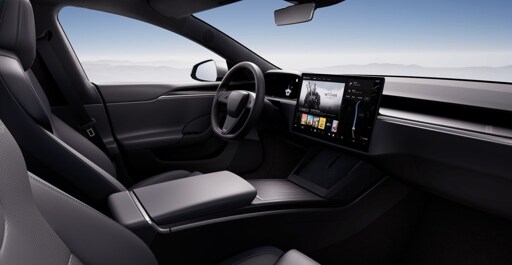
“The overuse of touchscreens is an industry-wide problem, with almost every vehicle-maker moving key controls onto central touchscreens, obliging drivers to take their eyes off the road and raising the risk of distraction crashes,” said Matthew Avery, director of strategic development at Euro NCAP, to the Times. To be eligible for the maximum safety rating after the new testing guidelines go into effect, cars will need to use buttons, dials, or stalks for hazard warning lights, indicators, windscreen wipers, SOS calls, and the horn.
The Euro NCAP’s safety guidelines aren’t a legal requirement, however, car makers take safety ratings pretty seriously, so any risk of points being docked during such assessments is likely to be taken into consideration.
I’m actually a fan of big screens, HOWEVER they should be limited to being an actual “infotainment” system only. All essential controls should be buttons, switches, and dials.
One thing I really like about the Lucid Air is that the big screen retracts. Makes it look and feel quite different, almost like an older car without the big screen.
Important controls like seats, temperature, and volume/pause are physical. So you can have the big screen when you want it, and it goes away when you don’t. More cars should do that, though the additional moving part probably isn’t great for longevity.
My vote is:
Best of both worlds
I think I agree. I would be fine with an infotainment system that:
My malibu meets 2 and 3, but the fact that if the infotainment system breaks it cripples the entire car, puts me on edge. This would be mitigated if actual functionality was outside of it, and that the touch screen was just a control layer.
I disagree. I don’t want to have to take my eyes off the road to change my music, or turn the volume up/down. They need to be physical buttons/knobs.
I have a giant screen, and physical buttons for volume and air temp.
Super happy with it.
There are buttons on the steering wheel to skip songs and adjust the volume.
If you get the fancy steering wheel option
You’ll be hard pressed to find a new car in 2025 that doesn’t have steering wheel controls unless you go out of your way to look for one (if there is any).
There should be two screens. One only visible from the navigators seat and always available. The other can be where it makes sense, but it should be disabled for all input when the car is not in park. When the car is in motion only limited information is allowed - you shouldn’t be able to tell what the name of the song playing is as that isn’t something you have any business reading. You should get some indication of what the next turn is, but even that needs serious UX work to ensure it is not distracting.
Exactly!
This pretty much summarises it.